The Guggenheim
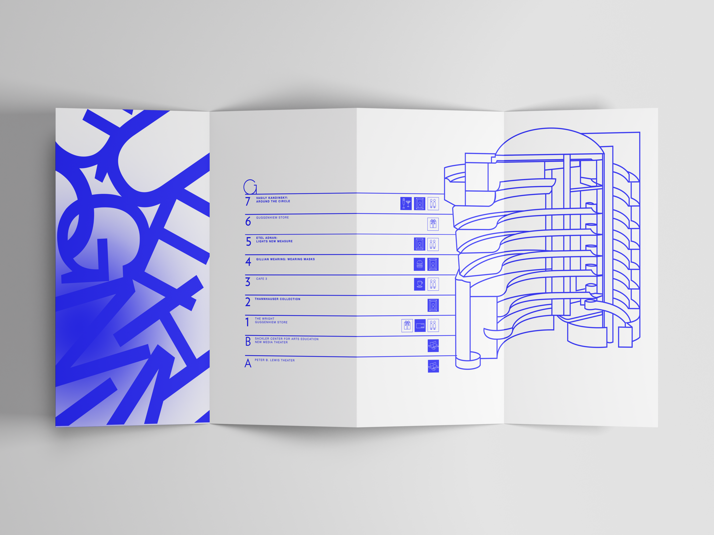
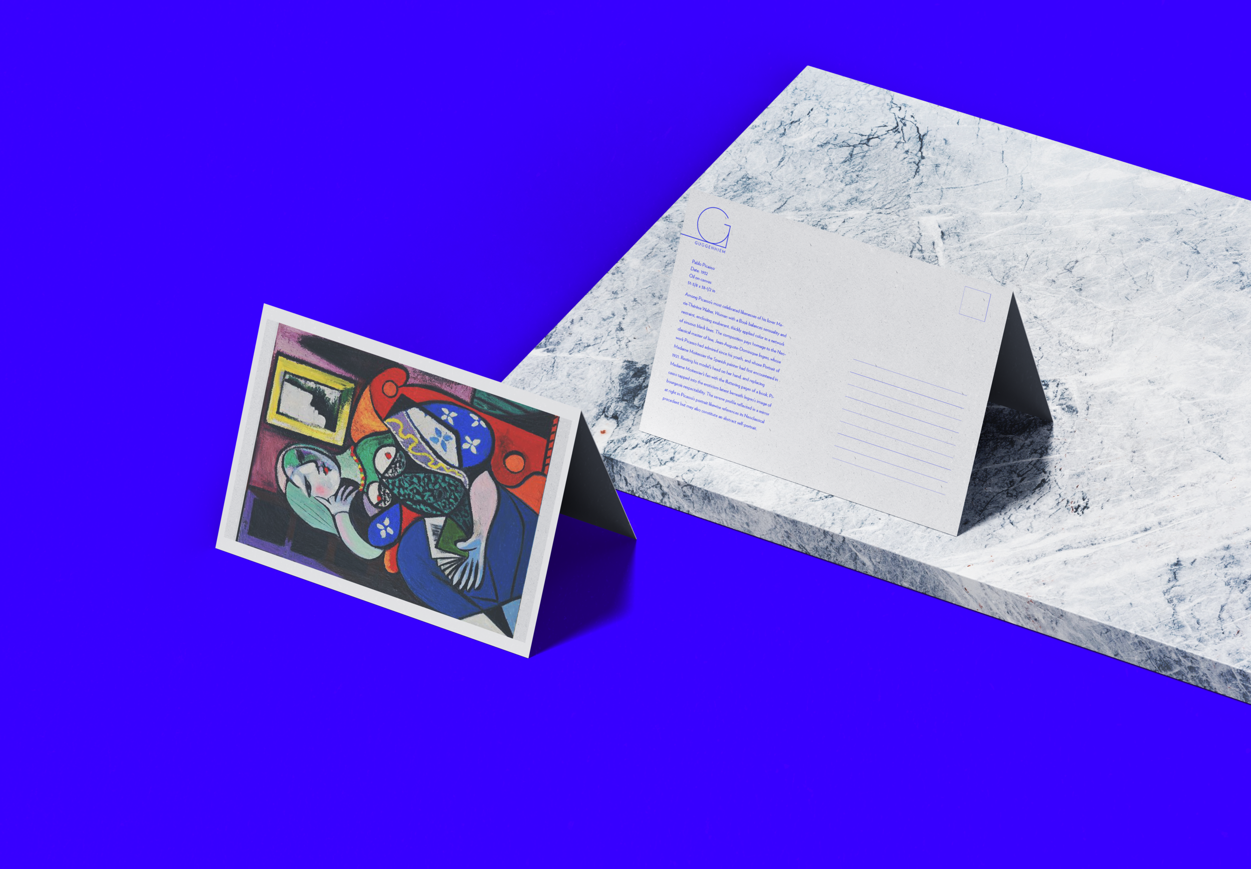
This brand identity project is a revamp of one of New York's most iconic Museums, the Solomon R. Guggenheim Museum. With competitors like the Metropolitan Museum of Art and The Museum of Modern art, the Guggenheim needed branding as bold and eyecatching to match the times. The museum's identity should be just as iconic as its architecture.
Branding Experiments
One of the first logo directions was to incorporate the unique curves of Frank Floyds Write's museum design. After further exploration, the idea seemed too obvious. After many icon explorations, the direction turned to use a G as a monogram. For fonts, I decided to stay with Verlag as the brand display font due to the iconic usage of the building itself. Color Incorporating a new vibrant blue.
One of the first logo directions was to incorporate the unique curves of Frank Floyds Write's museum design. After further exploration, the idea seemed too obvious. After many icon explorations, the direction turned to use a G as a monogram. For fonts, I decided to stay with Verlag as the brand display font due to the iconic usage of the building itself. Color Incorporating a new vibrant blue.
A New Direction
Iconography


